
Expressive sky. Part: landscape after-work. Recommendations.
|
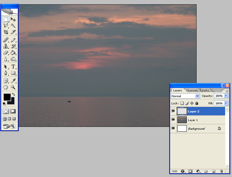
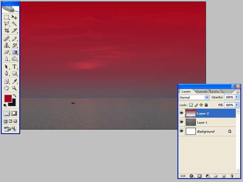
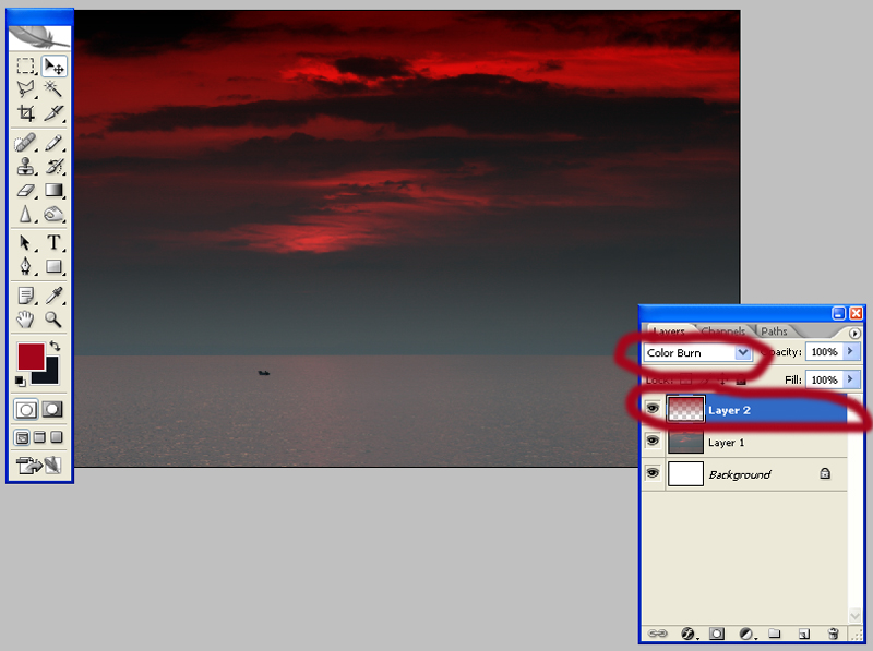
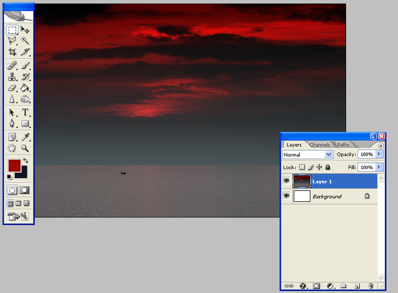
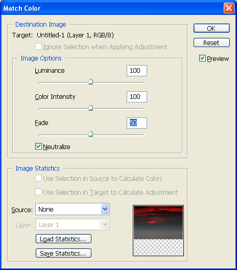
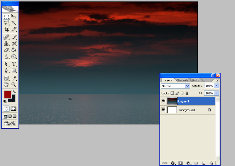
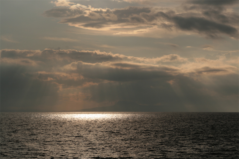
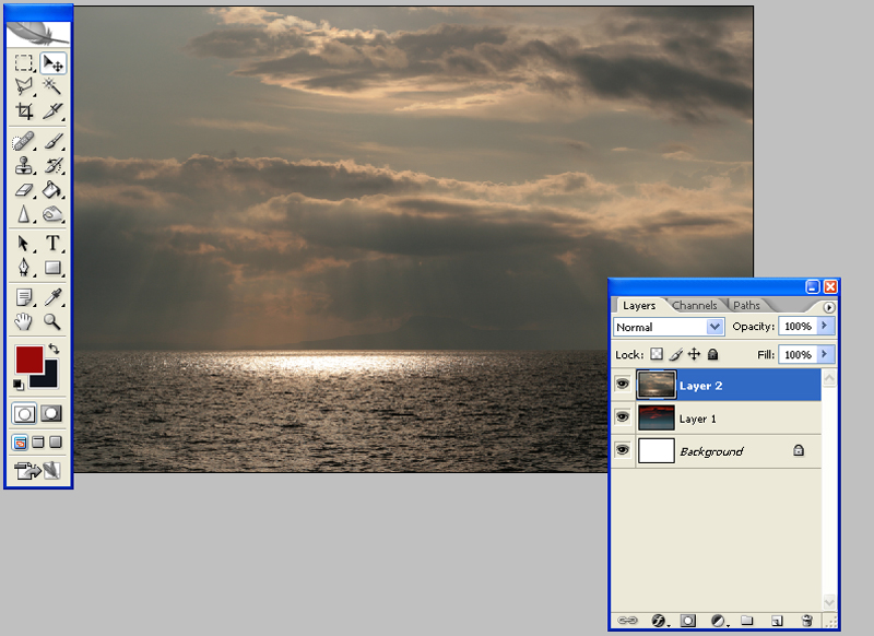
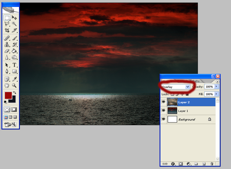
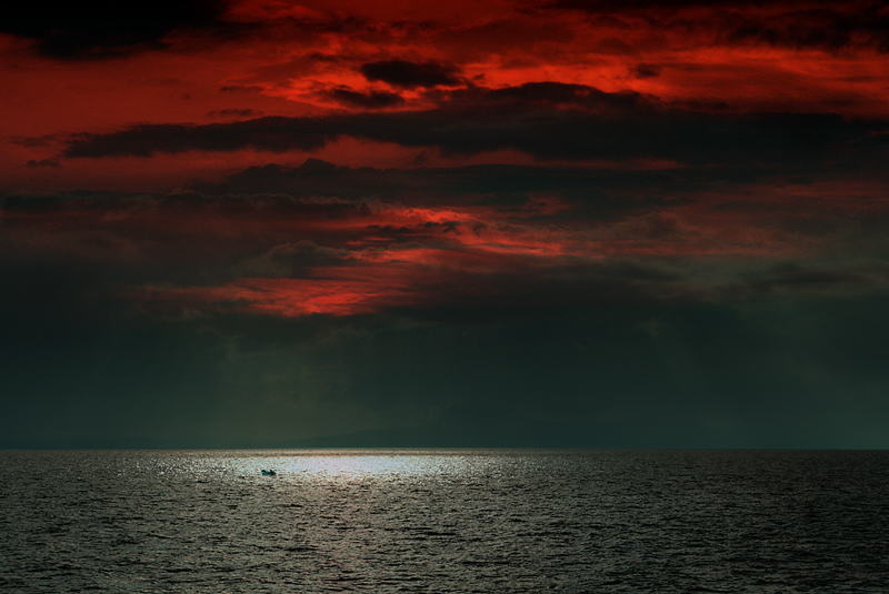
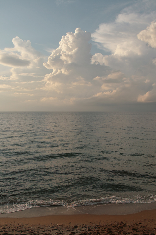
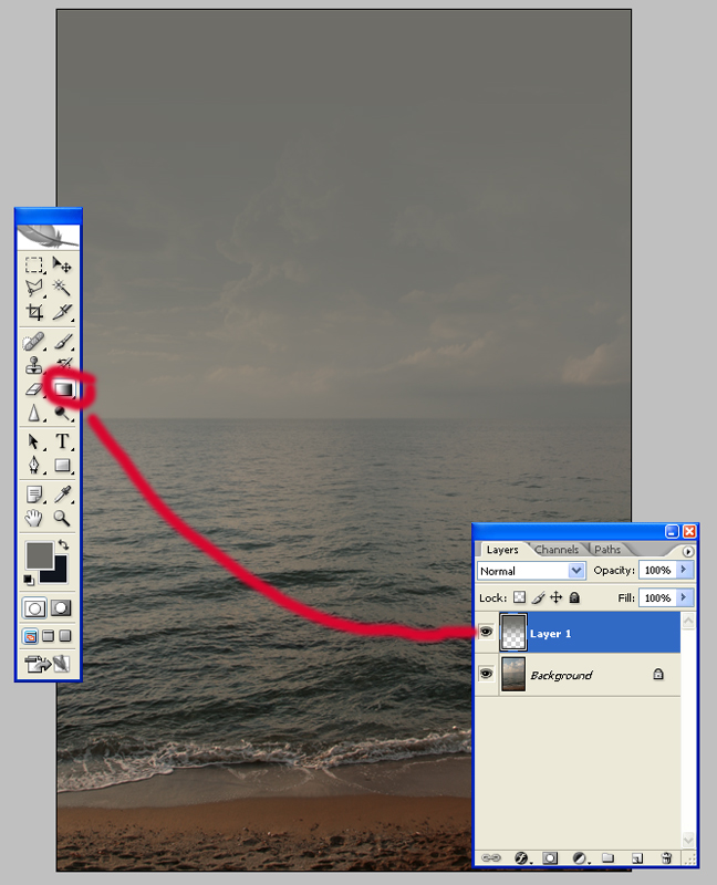
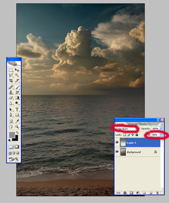
At this lesson we will study tools essential to give a sky at your picture expressiveness and tragedy. These are low level corrections for those who have recently started working with graphics editors. Let us start. Well, for beginning we need any picture. Let us take the one we have already used before – picture of lonely fisherman. So at this lesson we will work under the original sky at the picture and under the sky imported from another picture. What should we do in both situations? Open picture by Photoshop and create a new layer – “Layers 2” Then choose bordeaux colour, this case Bordeaux colour seems the most reasonable (by eyedropper tool at the colour box) and click “Gradient fill” (press at the left side of toolbar). Choose “paint bucket tool”, opacity 50% and fill layer 2 with bordeaux gradient below horizontal line at the picture. Then turn Layer 2 active (at the panel Layers it should be blue colour) and change its characteristics at your option. I changed to Colour Burn (it is marked by red at the picture). As a result the sky turned to massive night colour as in hell but expressive. Merge Layer 1 and Layer 2 Turn to active a new Layer (it is again Layer 1), go to tab Image>Adjastment>Match Color. Mark in the opened dialog box Neutralize and then move runner Fade on 50. That is what we have: Then for training go further and to original clouds we will add clouds imported form another picture. I have looked through my archives and found this picture of sea-sky. Open it as a new document, select, copy (Edit>Copy) and past into our picture as a new layer (Edit>Paste). Thus we get a new Layer 2 and such a picture. Below is Layer 1, which we have already worked on, above is a new Layer 2. |
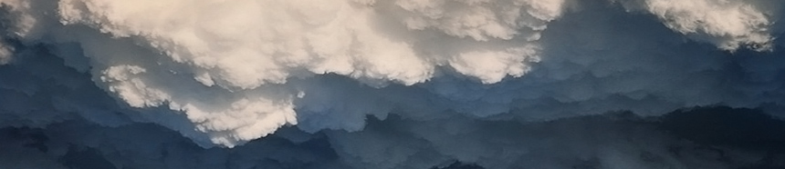
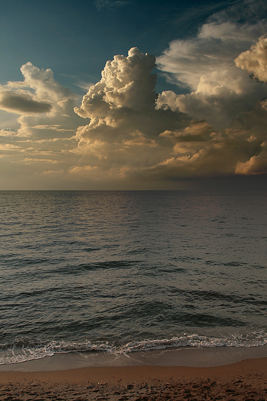
Little note. We work under only the sky so you can have a reasonable question: why we need to overlay image entirely (including the sea)? The answer is: the more manipulations with the sky the more the distance between land (sea), so the more visual difference in clolours and lightning at the both sides of the horizon. Picture became less realistic. Thus at one moment we decide to use Layers, which layout picture entirely, to smooth clolours and light-shadows. This case such Layer is Layer 2. To adjust Layer1 and Layer 2 horizontal levels I used a bit stretched Edit>Transform>Scale and combined horizontal levels of the Layer 1 and Layer 2. Further… Put Layer 2 active (at the panel Layers it should be blue colour). Then change its characteristics at the same panel. It was Normal, now – Overlay (marked red at the picture). And we get such a beauty. After this we add a bit sharpness to the picture, merge Layers and the picture is ready. One more major moment. At this example we cardinally changed interior. You can get the same result easier. You can add only one touch to give the sky more expressiveness (especially if you have already had nice clouds and the landscape is suitable). You should add gradient at a new Layer this way: Original picture: We put gray gradient at a new Layer: We changed gradient Layer characteristics (for example to Color Burn). You can add to the Layer a bit transparence at your option. Then merged, corrected sharpness and contrast and your new sky is ready! To be contined Dmitry Zhamkov 2006 |
Copyright © 2008-2024 www.zhamkov.com
Click on image to view full size