“Added product” definition. Photoergonomics (с).

|
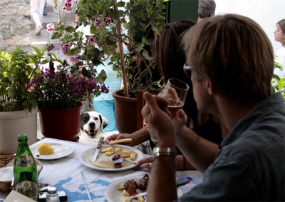
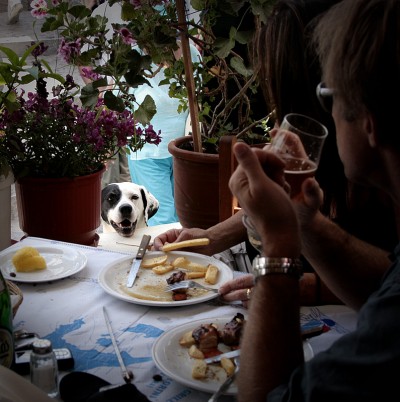
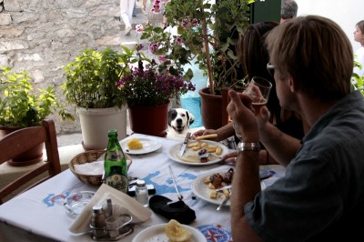
Let us continue discussion “masterpiece button”. Today we will talk about added product. Remind you that before we studied picture as a “product” and use “three-level product analyze” conception for it. We divided the picture into added product, main product and essence: (to get more information click: part №1 , part №2 ) Thus, below is short review of “added product” (AP). Before I have already described what it is and what for you need it: image form (size), easy browsing (additional editing to easy browsing), tone, name etc. Let us see AP features using this picture as example: Golden Section photography rule ). So we get following result: This version is much better but it is still does not render us initial feelings. In spite of the picture (size 800x560) fills full screen it is not possible for us to feel the “origin situation”. Definition “meaning centre” and compositional picture construction (in this case framing) allow us to select the major object of action or genre and help us to solve the problem. By putting into practice the AP features we help viewer to see the major in the picture. The framing was made by applying square framing, moving the dog closer to the centre and lowering lightning level along the picture edges. This is what we have got: |
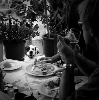
Subduing tonality or turning the picture to b/w colour we will increase compassion (to get more information click Archaic vision. Discussion about colour to b/w conversion methods). We have recently de-saturated the picture. The result is: To simplify the picture for viewer apprehension (by realizing AP features) for the two last picture versions we added additional sharpness after resized picture (so viewers could see the same situation as I saw in the original) Other important thing is the picture name. Name should express your mood while shooting and editing the picture. This case you will help the viewer feel your idea more detailed. For instance we could expose the 1st picture version and name it “We are at the restaurant”. Also we can expose the last picture version (b/w) and name it “…am I asking for a lot of?” To clearly comprehension let us combine our results and compare what we have now: Thus, version №1: “We are at the restaurant” Version №2: “…am I asking for a lot of?” In fact I do not want to convince people that graphics editor is universal panacea. Most probably it is a means of achieving the result, like as we achieve by using photo camera. Photo shooting skills, editing skills, comprehension of “why and for whom you are doing this” are the basis of “masterpiece”. To be continued D.I.Zhamkov Also see links: “masterpiece button” part №1 “masterpiece button” part №2 |
Copyright © 2008-2024 www.zhamkov.com


Click on image to view full size