
Learn from classics. Frank M. Boggs. Graphical maps of styles.
|
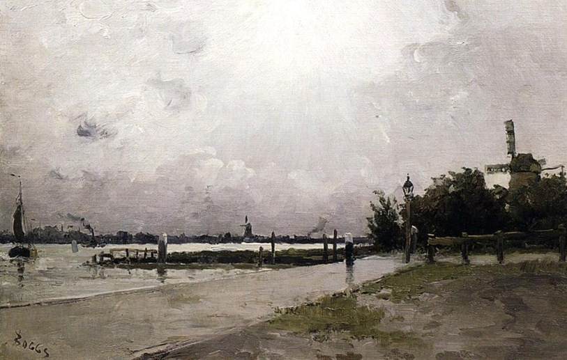
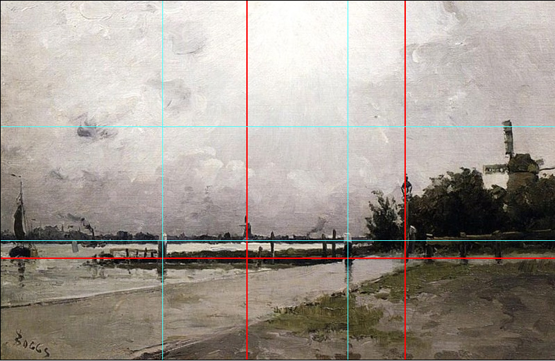
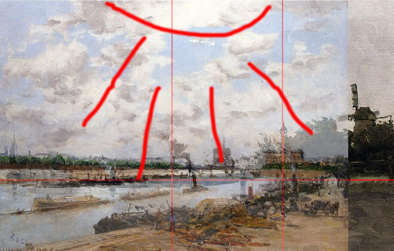
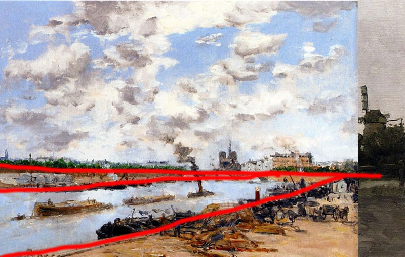
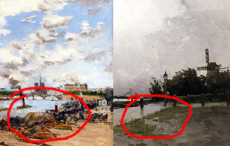
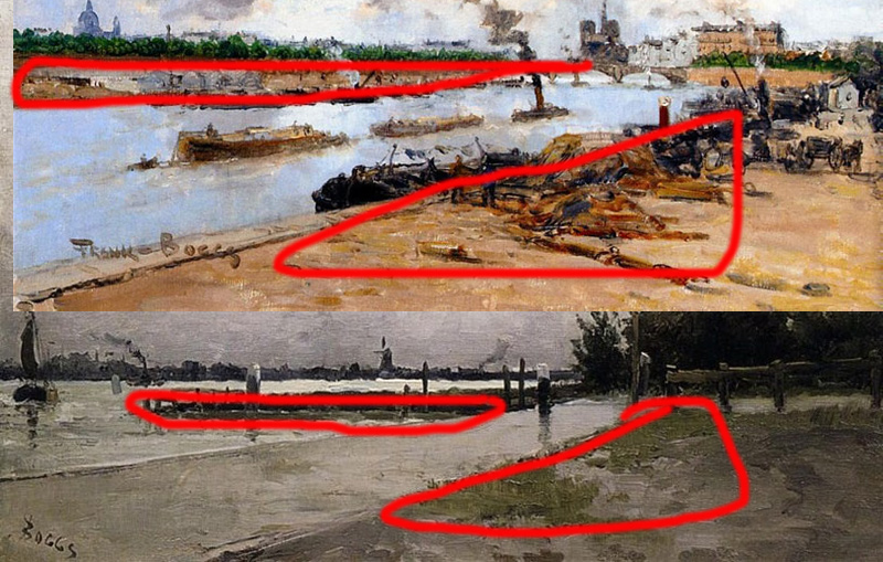
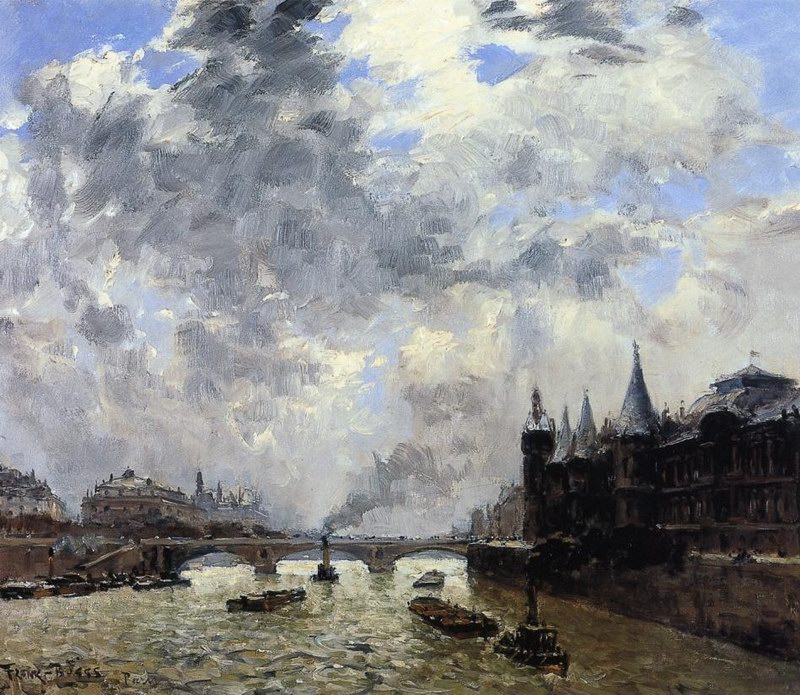
With this article I want to open new set titled “Learn form classics”. I hope to turn the set regular. The main of “Learn form classics” is engaged photographical analysis and understanding of great painters and photographers artworks as well as knowledge consolidation through laboratory self-examinations. We will learn together because it would not hurt you! We will start learning form landscape genre and… Frank M.Boggs – the famous artist of XIX century. By the way, our contemporary, the person with the similar name - Carole Boggs Matthews took a part in Photoshop SC2 creation. I have selected two similar styles Boggs artworks and we will try to analyze them from the compositional, colour and light decision point of view. Brief glance and we have prime impression: thirds ratios along the horizontal lines are strongly observed; active lines, which help you to choose special way of seeing the picture, are visible; symmetry is brightly stand out and there are an elements which balance each other. Certainly in painting it is easier to “balance” the picture. In this respect painting differs from photography because the painter could emphasize and add additional object at the picture as he want. While photographer could operate only with the objects which are already in frame (in case he doesn’t know how to work with Photoshop). Let us look at the main compositional combinations of the picture more thoroughly. Combinations (golden section) are ideal, but there are two different ways of looking at the picture (blue lines and red lines). The picture we are looking at probably was cropped before – this is not full frame. Two visible lines (horizon and berth), balanced objects located at the golden section crosses, all these make your eyes, following active lines, stop and study objects located in the centre (it is some kind of viewing speed regulator). To compare both pictures and determine common in their compositional structure I have choose the easiest way (to lay one picture over another). We can notice nearly identical compositional structure of both pictures. Have balanced horizontal lines we see that main diagonals, visual objects – all look like overlaid each other (for reference I notice that the pictures were painted in different years). In general even scheme of placing the lightning sources and light-to-dark patterns are similar. I want to indicate easy of viewing and geometry accuracy in the organization of pictures perspectives. The first picture has classical diagonal view (the diagonal goes from the left bottom corner of the picture) and pass through the whole picture nearly up to the horizontal line at the right side. In the first variant perspective became gentler and we do our first step into the picture content. This case the diagonal started from the left bottom corner divides the object (in our case this is the path) into two parts. |
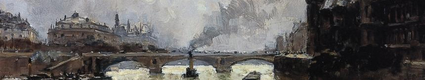
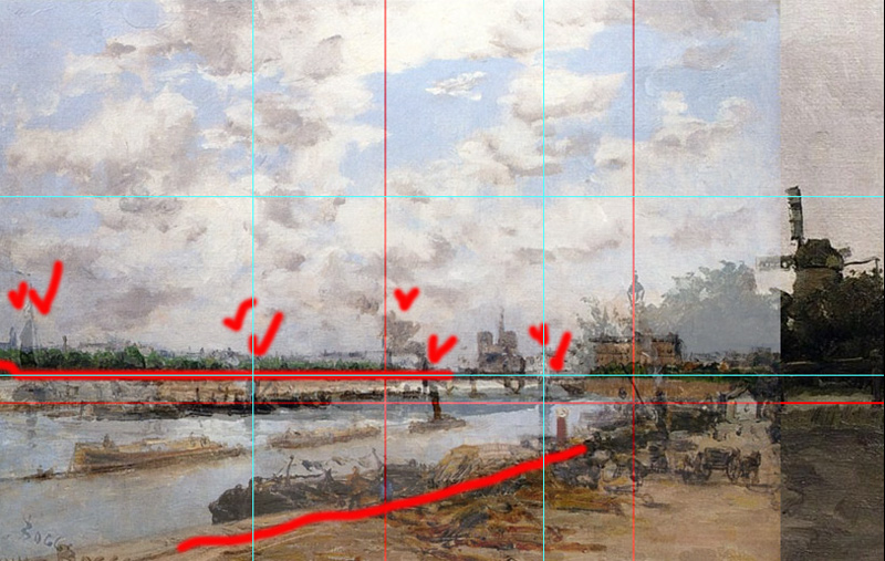
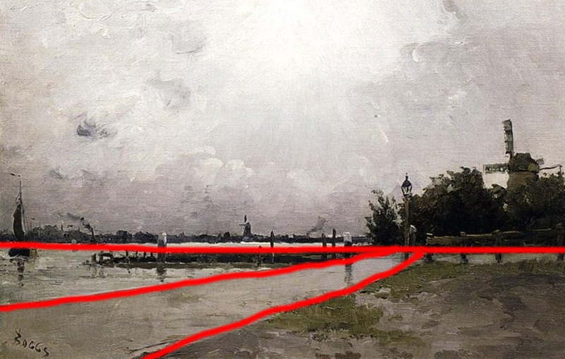
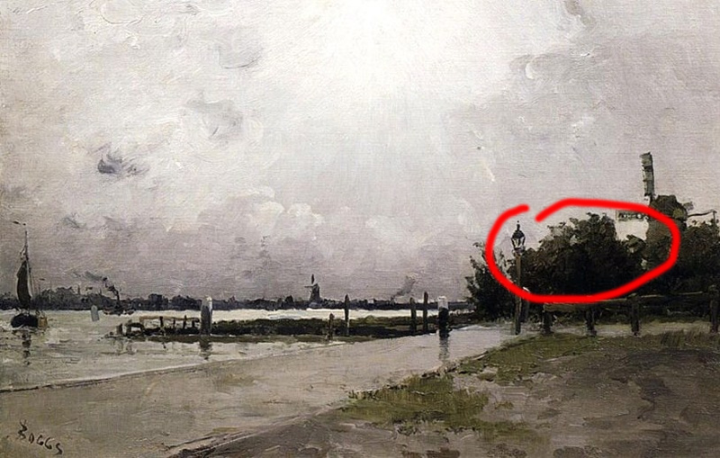
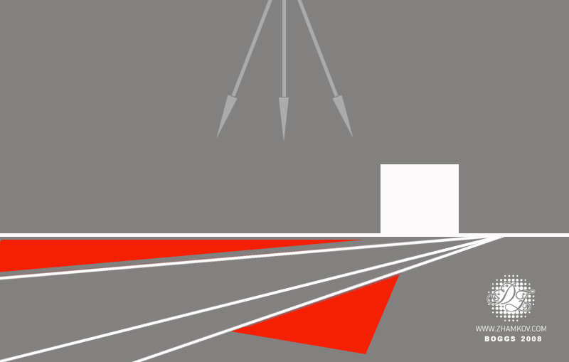
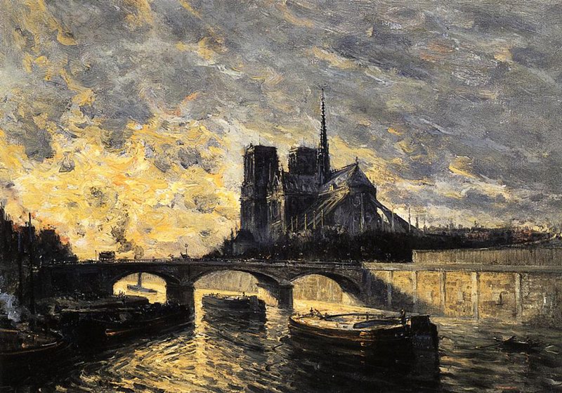
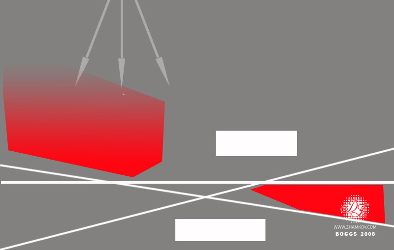
Placing of one of the concept centers in the right part of the picture looks like a regularity (for both pictures). This is as regards the trivial objects (for instance balance objects). It is essential to pay attention to tone structure of the pictures. Placing of colour accents has some regularity for both pictures. For example brown and green tone accents on the right side of both pictures. Regularity exists in forming colour compositions which deepen perspective and stress active lines, diagonals. In fact you can find more regularities but for the first time it is enough. Let us resume. Well, Mr.Boggs, we would not treat you used tracing paper and stencil during the creation of your pictures. Have thoroughly studied your pictures we concluded that regularity in your pictures is the result of your classical art education based on dogmas and rules of that period. Other words these are classical canons of art and composition which were taught to artist long time ago and certainly adjusted by artist individuality. Thus we found out one of the variants of classical landscape composition creation. Thank you Mr.Boggs. To use in practice these so called style scheme pictures or “style map” I want to save them as a graphic maps which could be useful for all photographers. Such picture №1 is from Mr.Boggs. (I believe it could be filled with trivia details): Some more Mr.Bogg’s pictures, city’s perspectives. We have already known the regularities form the first two pictures – strict rule of horizontal thirds (this gives us such large and pattern sky). New elements, regularities of imaging bridges, diagonals which create irregular trapeziums. An active lines crosses. This is how I imagine style map for Mr.Boggs landscape. The main role is paid not only to big objects but also to compositional centers (visual, contrast colour and light spots), which sometimes take a part in composition creation. I want to draw your attention to perspective lines and compositional crosses. To be continued... Dmitry Zhamkov 2008 |
Copyright © 2008-2025 www.zhamkov.com
Click on image to view full size