
Archaic vision. Discussion of conversion methods of colour picture to black-and-white.
| "Any colour converted into black-and-white could be completely described as white colour with different level of brightness. Moreover level of brightness is different depends of method of conversion". Let us discuss two questions: 1. What is the reason of conversion colour picture to b/w? In other words what arguments we have when we are going to deny colour information of the picture and completely convert the picture to b/w? 2. Technical aspects of conversion to b/w. What method is better and what we should realize to correct conversion colour to b/w. I hope that to the end of discussion everyone could give right and precise answers for all questions above, also everyone could correct and consciously convert ccolour picture to b/w. With our colleague-photographers assistance we performed many tests of conversion colour picture to b/w. As it was supposed there were a lot of results and methods of such conversion and only a few regularities. Thus we have obvious resume – there is no single correct method of conversion from colour to b/w! Is that really so? What the photographer is guided by when he converts b/w picture from colour? Let us find out! At the first stage we would not analyze, just let us look at the picture changing during conversion from colour to b/w. We will simplify all processes, trying to show how different conversion methods impact on the picture. During the test I deliberately will use conversion settings “on default”. In other words we will see b/w picture as our Japanese-American colleagues – converters creators - see it. First of all we will look after b/w tonality changing, depends on colour of the original as well as we look after the colour, namely its transformation process. For our test we need such excel which include basis spectrum colours and their half-tones with respect to grey. 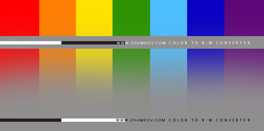 Method №1 Certainly I started from the easiest Photoshop instrument – Desaturate (Image>Adgastment>Desaturate) or colour removal. Look at what we have:  Method №2. It is more advanced if you use it correctly. It is called Channel Mixer (Image>Adjastment>Channel Mixer). We do not need change anything, just mark "Monochrome" in channel Red (Gray). Look at what we have:  Method №3. We use not managed plugin, i.e. plugin which have minimum possibilities of additional changing during the conversion. This case I used Showit effects. This is the result we have:  Method №4 It is plugin too, but at my opinion it has enough additional settings Theimagingfactory Convert to B/W Pro. This is the result we have for settings “on default”.  Final is Method №5, Photoshop, simply picture conversion from colour Grayscale.  There a lot of picture conversion methods exist, but at this stage methods, mentioned above, will be enough for us. Thus we can see that the result is different depends form the method we choose. Continue. To expand our associations to maximum – we will add the picture to our spectrum test picture. Now we will repeat methods at the same succession: Method №1- Desaturate Method №2- Channel Mixer Method №3- Showit effects Method №4- theimagingfactory Convert to B/W Pro Method №5- Grayscale Put together all results and look at that we have: 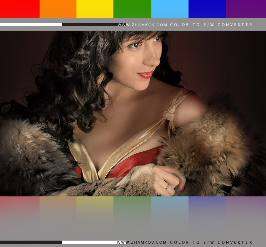 1. 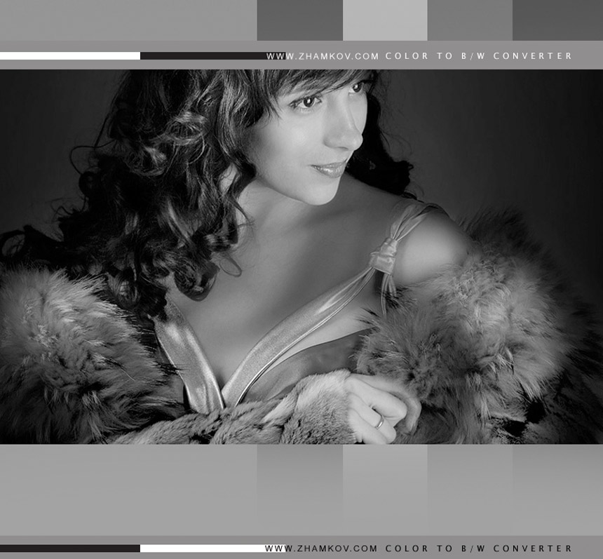 2. 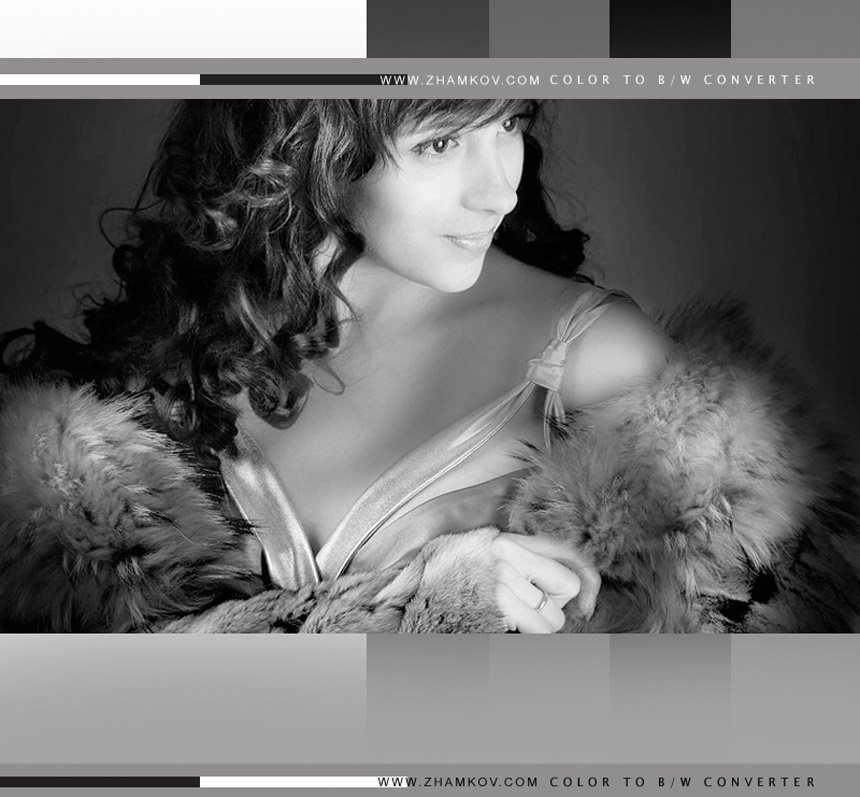 3.  4. 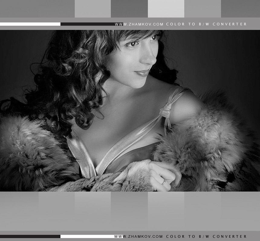 5. 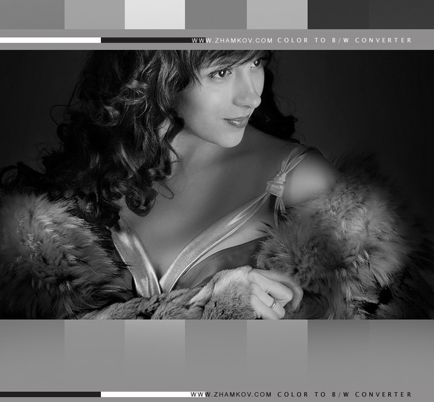 At the current moment we have enough methods, now we do not choose method (bad/good - effective/effectiveless), but we are trying to understand how colours and colour changing impact to sensing do vary. I recommend you to pay attention not only to lost colours but also to colours which, depends of conversion method, exchange with neighboring colours brightness and tonality. For example, look at blue-violet colours changing depends on applied method – nearly inversely (i.e. at the beginning blue is light and violet is dark ant then in inversely). Can you imagine how such changing varies our work from, for example,compositional point of view. To more detailed comprehension of such changing, we will look at physics of the process. Before I have told that the roots of these processes are more deeply than it could seem at the beginning. Certainly individual features of sensing as well as biological are the reasons. Because the only organ of receiving visual information is our eyes, and as Wertenbaker said: ...passing through the light, turns it in mind to amazingly complicated images. «Eyes could recognize approximately 10 millions light intensity gradations and 7 millions colour tones…». If we look at more thoroughly, we could see that special type of light sensitive cells named “rods” are responsible for light intensity gradations, namely b/w information, which we perceive. The structure of our eyes is that thanks to “rods” we, opposite to photo-camera, can see in a dark. We sense light-to-dark picture (black/white) infiltrated through physiological features of sensing then we create an image based on acquirements. In other words we associate comprehended different intensity light spots with acquired in the process of sense creation standards. Now we are not talking about the colour which other sensors – “cones” are responsible for, we are talking about “the oldest vision”, which allows us to sense colour and its intensity as b/w!!! In fact every colour converting to b/w could be associated with white colour lighted with different intensity. Thus it could not be said definitely about brightness depth comparison of previous colour with its b/w clone. Everything depends on sensing, method of conversion to b/w and surroundings of other colours – whole colour appearance of the original picture (i.e. surrounding of the colours). The stripe below performed as colour by method: white square is normally lightened (on the left side), then white square minus 20% lightness etc.  Then choosing, for example, red colour at our test picture, we can correlate its intensity after converting to b/w with exact square form the stripe. Depends on conversion method, red colour is correlated with nearly all represented squares. In other words: "Any colour in b/w converting could be described as the whole white colour with different level of lightened and, depends on conversion method, brightness level, to perform conformity, varies". That is my resume. As I satisfied with the definition, I decided to name it “Zhamkov rule”. There is a theory that b/w vision is archaic ability of vision. That means that our relatives see the world in b/w colours, some people even now colour-blind person (if we do not treat it as illness), many animals can see only in b/w colours. As it is supposed b/w vision is more practical, contrast and reliable... As for explanation so all of us since birth can sense (detect) flows of light, but to shape the light, received by our eyes, or process in our mind received information – that is the feature of sense. The child in moment of birth does not know that colour spot which was scanned by eyes is, for example, a ball. Brains identify it as a ball only when child’s mother names it “ball” etc. We do not need colours for this, sometimes colour could even confuses everything Let us resume this part of tutorial. In result of tests and reasoning we fund out that: - there are exist many methods of conversion from colour to b/w; - it is better to use methods which allow us to manage conversion process; - correct b/w image is subjective definition; - in process of conversion image to b/w the same colour interpretation varies depends on method of conversion; - in many cases in process of conversion to b/w image, compositional centers repositioning. To be continued… Dmitry Zhamkov 2008 |
Copyright © 2008-2025 www.zhamkov.com